

n today’s data-driven world, businesses, analysts, and managers rely heavily on dashboards to make informed decisions. Among the most versatile tools for creating dashboards, Microsoft Excel remains a go-to solution due to its flexibility, accessibility, and powerful analytics capabilities. This article provides a step-by-step guide on how to make a dashboard in Excel, from beginner-friendly techniques to advanced, professional approaches.
Whether you are tracking sales, monitoring KPIs, or visualizing operational data, this guide covers everything you need to design, implement, and maintain Excel dashboards effectively.
What is an Excel Dashboard and Why It Matters
An Excel dashboard is a visual interface that presents key metrics, trends, and insights from raw data in an easily digestible format. It consolidates tables, charts, and KPIs (Key Performance Indicators) into one interactive display, enabling decision-makers to understand performance at a glance.
Why Excel Dashboards Are Essential:
- Data Consolidation: Aggregate data from multiple sheets or sources into a single visual summary.
- Decision-Making: Facilitate faster, informed decisions with visual insights.
- Interactivity: Use filters, slicers, and pivot tables for dynamic exploration.
- Customization: Tailor dashboards for any department, from sales and marketing to finance and operations.
A well-designed Excel dashboard is not just a report; it is a powerful tool that transforms raw data into actionable insights.
Step 1: Define Your Dashboard Objectives
Before creating a dashboard, you must clearly define its purpose. Understanding your objectives ensures your dashboard is effective and relevant.
Ask yourself:
- What KPIs or metrics are critical for your audience?
- Who will use the dashboard – managers, analysts, or clients?
- How frequently will the dashboard be updated?
- What decisions should the dashboard influence?
Example: For a retail business, key metrics might include monthly revenue, profit margin, inventory turnover, top-selling products, and regional performance.
By establishing objectives, you set the foundation for data collection, visualization, and design choices.
Step 2: Collect and Prepare Your Data
Data preparation is critical. A dashboard is only as good as the data behind it. Use the following steps:
- Organize Raw Data: Place raw data in separate Excel sheets and use structured tables.
- Go to Insert → Table to convert ranges into tables.
- Clear, labeled columns improve formula efficiency.
- Clean Data:
- Remove duplicates (
Data → Remove Duplicates) - Ensure consistent formats (dates, currencies, text)
- Avoid merged cells, which break formulas
- Remove duplicates (
- Normalize Data:
- Use consistent units (e.g., USD for all revenue figures)
- Standardize categorical values (e.g., “East” vs “EAST” vs “E.”)
- Separate Raw Data and Dashboard Sheets:
- Keep your raw data intact
- Perform calculations in separate sheets
- Link calculated metrics to the dashboard for clarity
Pro Tip: Using Power Query (Excel 2016+) can automate data cleaning and merging from multiple sources, saving hours of manual work.
Step 3: Identify Key Metrics (KPIs)
After data preparation, identify the metrics that matter most. KPIs should reflect objectives and answer critical business questions.
Common KPIs for Excel Dashboards:
| Dashboard Type | KPIs |
|---|---|
| Sales | Total Revenue, Average Order Value, Sales Growth, Top Products |
| Finance | Net Profit, Expense Ratio, Cash Flow, Return on Investment |
| Marketing | Website Traffic, Conversion Rate, Lead Generation, Customer Acquisition Cost |
| Operations | Inventory Turnover, Order Fulfillment Rate, Production Efficiency |
Formulas to Calculate Key Metrics:
- Total Revenue:
=SUM(SalesData[Revenue]) - Average Order Value:
=AVERAGE(SalesData[OrderValue]) - Growth Rate:
=(CurrentMonthRevenue - PreviousMonthRevenue)/PreviousMonthRevenue - Conditional Metrics:
=IF(Profit>1000,"Good","Needs Attention")
Calculating KPIs accurately is critical for reliability and credibility. Errors in formulas can mislead decision-makers.
Step 4: Choose the Right Charts and Visuals
The right visualization ensures data is easy to understand. Excel offers a variety of chart types:
- Column/Bar Charts: Compare categories or periods.
- Line Charts: Track trends over time.
- Pie/Donut Charts: Show proportions of a whole.
- Combo Charts: Combine multiple metrics (e.g., revenue vs profit margin).
- Sparklines: Mini trend charts in cells for quick insights.
- Conditional Formatting: Highlight key values with color scales, icons, or data bars.
Best Practices:
- Use consistent color schemes to avoid confusion.
- Avoid 3D charts; they distort data perception.
- Label axes and include legends for clarity.
- Highlight key trends, not just raw numbers.
Pro Insight: Use dynamic charts linked to named ranges or tables. As data updates, charts refresh automatically.
Step 5: Add Interactivity
A static dashboard is less effective. Excel allows interactive elements:
- Pivot Tables:
- Summarize large datasets dynamically.
- Drag fields into rows, columns, and values.
- Filter by slicers for easy exploration.
- Slicers:
- Insert → Slicer → Connect to pivot tables or charts.
- Allows filtering by categories like Region, Product, or Month.
- Drop-down Menus:
- Data → Data Validation → List
- Let users select metrics or categories.
Advanced Tip: Use Excel formulas like OFFSET and INDEX for dynamic ranges. Combined with drop-down menus, this creates fully interactive dashboards.
RELATED:
How Excel Business Modeling Helps Nigerian SMEs Survive Inflation and FX Risks
Excel Business Analysis Case Study: How to Simulate Sales and Profit for Smarter Decisions
Finance for Small Business Made Simple: Deep Insights to Scale, Sustain And Succeed
Step 6: Design a Clean Layout
Dashboard design influences usability. Key principles:
- Hierarchy: Place KPIs at the top, trends in the middle, detailed data at the bottom.
- White Space: Avoid clutter; leave breathing room between sections.
- Alignment: Center charts and tables for professional appearance.
- Consistency: Same fonts, colors, and chart styles throughout.
- Highlight Key Insights: Bold critical numbers or use color coding.
Example Layout:
| Section | Content |
|---|---|
| Top KPIs | Revenue, Profit, Sales Growth |
| Middle Charts | Monthly Revenue Trend, Top Products, Regional Performance |
| Bottom Tables | Detailed Data Table, Raw Data Summary |
Design Tip: Use shapes, borders, and text boxes to group sections visually.
Step 7: Test and Validate the Dashboard
Before sharing, ensure the dashboard is accurate:
- Check all formulas and totals.
- Validate KPIs against raw data.
- Test slicers and drop-down filters for responsiveness.
- Ask a colleague or stakeholder to review usability.
Regular validation ensures the dashboard remains reliable over time.
Step 8: Automate Updates
For dashboards to remain useful, they must be easy to update:
- Use Excel Tables (
Insert → Table) so formulas auto-expand. - Connect to live data sources using Power Query.
- Refresh pivot tables:
Data → Refresh All. - For recurring reports, save as a template to reuse structure without redoing charts.
Automation reduces manual errors and saves time.
Advanced Techniques for Excel Dashboards
- Power Pivot:
- Allows handling large datasets efficiently.
- Create relationships between tables and complex calculated fields.
- Dynamic Dashboards:
- Named ranges + OFFSET formula for dynamic charts.
- Combo charts linked to drop-down menus for multi-metric visualization.
- Conditional Formatting for Dashboards:
- Highlight KPIs automatically when thresholds are met.
- Example: Revenue below target → Red, Above target → Green.
- Sparklines for Mini-Trends:
- Small cell-based charts for monthly trends.
- Use line, column, or win/loss formats.
- Integration with Power BI:
- Export Excel data to Power BI for more advanced interactive dashboards.
- Useful for enterprise-scale analytics.
Common Mistakes to Avoid
- Too Many Metrics: Focus on KPIs that matter; clutter confuses users.
- Poor Data Quality: Inaccurate data leads to wrong decisions.
- Overuse of Colors/3D Charts: Keep visuals simple and professional.
- Ignoring Users: Design dashboards for the end-user perspective.
- Static Charts: Use dynamic features to keep the dashboard interactive.
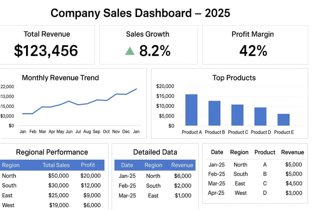
Case Study: Sales Dashboard Example
Imagine a company wants to monitor monthly sales performance. The dashboard includes:
- KPIs: Total Revenue, Sales Growth, Top 5 Products
- Trend Charts: Line chart for monthly revenue, bar chart for product sales
- Regional Analysis: Pivot table showing sales per region
- Interactivity: Slicer to filter by product category
Impact: The management team can instantly identify underperforming products or regions, make timely marketing adjustments, and track monthly growth.
Tools and Resources
- Excel Tables & Pivot Tables: For structured data and summaries
- Power Query: For cleaning and merging data from multiple sources
- Power Pivot & DAX: For advanced calculations
- Conditional Formatting & Sparklines: For visual trends
- Slicers & Drop-downs: For interactive filtering
This is how professional dashboad looks like.
Sources for Best Practices:
- Microsoft Office Support: Excel Dashboard Tips
- Chandoo.org: Excel Dashboard Tutorials and Templates
- PWC Reports: Effective KPI Dashboard Design in Business Analytics
Conclusion
Creating a professional Excel dashboard requires a combination of data preparation, KPI calculation, effective visualization, and interactive design. From beginners to advanced users, following a structured approach ensures dashboards are accurate, insightful, and visually appealing.
By mastering Excel dashboards, you can transform complex datasets into actionable insights that drive business success.
Leave a Reply